Jason Kidd Invitational Branding
Description: The 1st Annual Jason Kidd High School Invitational brand identity features three complementary logos I designed for different purposes. The official tournament logo anchors the brand with Berkeley colors and basketball-inspired elements, creating a strong foundation for this prestigious event at Haas Pavilion.
For social media, I created a compact icon that maintains brand recognition even at smaller sizes. The third variation offers a fresh perspective that resonated strongly with organizers while preserving the modern, sporty aesthetic that runs throughout the collection. Together, these designs establish a cohesive visual identity that's versatile enough for all applications while celebrating the tournament's Berkeley roots and basketball heritage.
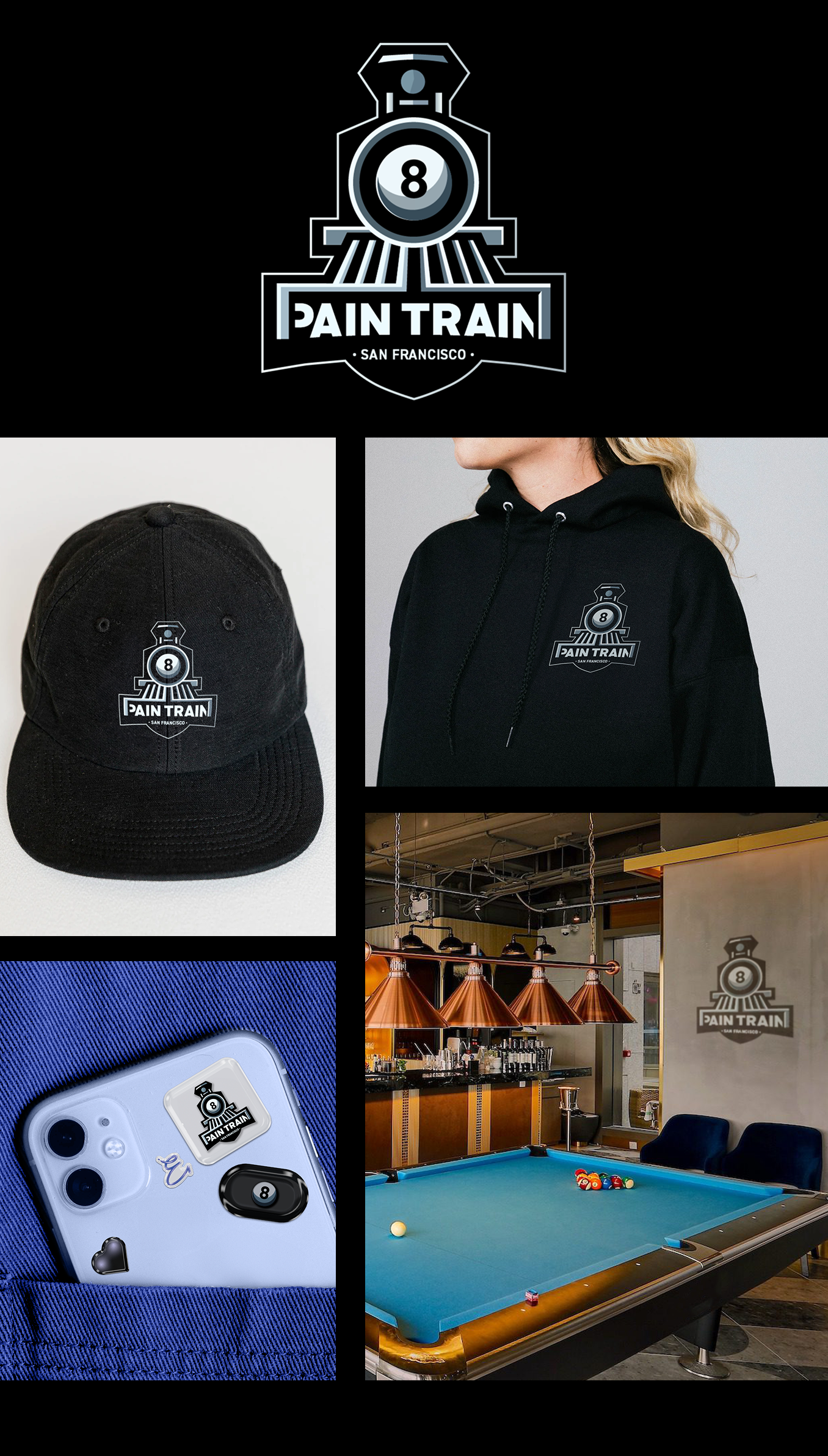
Pain Train Logo
Description: For the Pain Train pool team of San Francisco, I designed a logo that merges the worlds of billiards and locomotive power. The design features a stylized train with an 8-ball as its headlight—a clever visual fusion that immediately communicates both strength and precision.
Using a sleek black, white, and silver color palette, the logo maintains a sophisticated yet bold aesthetic that's easily recognizable from across the room. The strong geometric shapes and clean lines create a modern, powerful identity while ensuring the logo remains distinct and memorable. The result is an emblem that captures the team's competitive spirit and unique personality, ready to intimidate opponents before the first break.
Wine Label
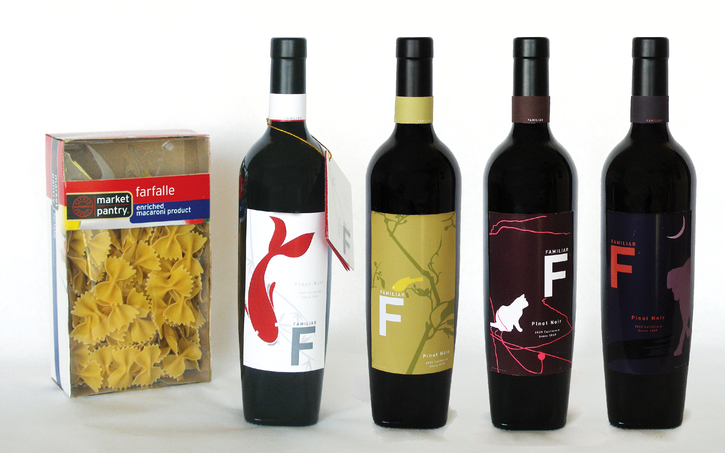
Description: For this college project, I developed a cohesive wine label series for "Familiar" Pinot Noir that explores the relationship between animals and design. Each label features a different creature—a koi fish, a bird, a cat, and a dog—rendered in a clean, minimalist illustration style. I carefully selected distinct color palettes for each label that complement the overall composition while maintaining brand cohesion through consistent typography and layout.
The success of these designs extended beyond the classroom when Eleven Inc. advertising agency later incorporated my wine label into their Shipt campaign: "We bring the store to your door." The bold "F" typography and distinctive animal motifs created immediate brand recognition in the transit advertising, demonstrating how thoughtful design can transition seamlessly from concept to commercial application.
Burning Man Camp - Logo Exploration
Description: In this logo exploration for the Burning Man theme camp "Little Tenderloin," I transformed San Francisco's often misunderstood neighborhood into a playful visual narrative. The design series embraces the district's gritty reputation with a humorous twist, featuring a cartoonish poop character as its central motif.
The main logo presents this character proudly displaying a rainbow tongue—a nod to San Francisco's vibrant LGBTQ+ heritage—while flying a flag that incorporates the iconic Burning Man symbol with "lil'" text, creating a direct visual connection to the festival while signaling the camp's spirited approach. By recontextualizing elements often associated negatively with the neighborhood into whimsical, approachable designs, these logos invite Burning Man participants to engage with urban realities through the lens of art, humor, and community—core principles of both San Francisco culture and the Burning Man ethos.


